Search This Blog

Monday, March 29, 2010

Plan for Easter (2 weeks)

1st Week 29th March

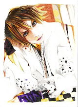
  • Move away from artists' influence and start developing own style
  • Start thinking about storyboard layout and story
  • Rough draft of drawings first before working on the final outcome, which will be a series of illustrations put together with a bit of text (?)


2nd Week 5th April

  • Start to think about scale (decide whether it would simply be traditional or whether it is possible to scan it onto the computer and work from there)
  • Decide on what materials to use. (Mostly inks and watercolours, but what else?) 
  • Start to carry out ideas, techniques and original style that have been developed and working towards a final outcome.


.

Saturday, March 20, 2010

Gouache


To achieve a layered effect, I experimented with gouache paint, which can be used in a very diluted form (like watercolour) or in a thicker format (such as poster colour). 
I can also build up the colours by applying layers on top of each other. For the lighter areas, I diluted the colours a lot so as not to let it dominate too much. The darker areas are much thicker, allowing me to put more than one layer on certain areas.
I have to keep in mind to not overdo the layering, as the paint would eventually crack when it becomes too thick.

Oil Pastel Sketches


The following are more observational drawings done in oil pastels. Again, I have been experimenting with various colours to achieve different effects.
This one consists of warm colours.


I also tried combining cold colours together. I took the technique a step further by bringing in other materials like ink washes, and colour pencils for fine details, paying extra attention to highlights and tone.

Friday, March 19, 2010

Health and Safety: Drawing Inks

HAZARDS IDENTIFICATION
Present no hazard to health under normal conditions of use

FIRST AID MEASURES

Eye Contact Irrigate with water for several minutes. Seek medical attention if symptoms persist.
Inhalation Unlikely to be a route of entry.
Skin Contact Wash with soap and water immediately as dried film is water resistant.
Ingestion If swallowed do not induce vomiting. Give water to drink and seek medical attention.

ACCIDENTAL RELEASE MEASURES

Small spillages should be wiped with a damp cloth or flushed away with water. Large spillages should be absorbed onto sand or earth and collected in a suitable container for disposal.

HANDLING AND STORAGE

Colours can stain. Take the necessary precautions to protect clothing and furnishings. Product should not be allowed to freeze.

DISPOSAL
Small quantities may be disposed of as domestic waste. Large quantities in accordance with local authority regulations.

Health and Safety: Watercolour

Hazards
  • Low hazard expected under normal conditions of use
First Aid Measures
  • After contact with skin wash immediately with plenty of water
  • Contact with eyes, immediately wash out with plenty of water for several minutes and seek medical advice if irritation persists
  • Ingestion; give plenty of water to drink and seek medical attention if ill effects occur
  • Inhalation; is unlikely to occur. Remove patient to fresh air
  • When in doubt or symptoms persists, seek medical attention
Exposure controls/personal protection
  • Use good personal hygiene practices
  • No special vantillation is required unless the product is used in a spray form.

Sunday, March 14, 2010

Responses to Dave McKean's work

I tried to create a similar effect of Dave McKean's drawings using materials that were available to me. These drawings were done with oil pastels on coloured sugar paper to achieve a sandy texture.
I started by copying the image from Dave McKean to familiarize myself with the style and technique.

The background was particularly challenging to achieve, but I tried using dynamic linear forces with oil pastels to resemble the original as best as I could, using similar colours.
I then developed the concept further by doing observational drawings of classmates using the same materials and style, also experimenting with more vibrant/warmer colours to achieve a different effect.
I chose a suitable colour of paper for the background to accentuate the subjects. For instance the blue tone works harmoniously with the green background, both of which are cold colours. Above: The purple background compliments the red tones, in a sense that the red is a warm colour whereas the purple is more like a subtle blue shade.


Dave McKean

I noticed a resemblance of Dave McKean's style in my ink drawings. I took examples of his comic/ storyboard, which were made using a variety of materials (the drawings were usually done in ink, chalk or charcoal) and collage technique.
His style have a rather dark and gloomy aura, mainly due to his choice of dark colours (usually cool colours like dark blue and violet) and rough cross-hatchings with charcoal to add depth.


The subjects seem to be worked over a black background, adding a greater sense of menace to the atmosphere. Some parts of his drawing are quite simple with only the outlines of the subject and stained with a touch of colour.


McKean's collage technique is more apparent on some pages. He arranged layers of photographs and text on top of each other to accent his drawings. The choice of colours still remain the same.

Ink sketches from imagination


A few examples of ink drawings from my imagination. I tried to portray a sense of fantasy in them by coming up with commonly peculiar structures that tend to exist in the genre.

Ink drawing from reference


Using DiTerlizzi's drawing of a Boggart, I re-enacted his character with ink, picking out the shape with continuous lines and then adding a wash of colour to it with watercolours.


The transparency of the colours give the character a convincing form, particularly the bottle, which appear to be see-through.


I built up the tone with layers of washes; the darker areas consists of a couple of layers of colour, whereas the the lighter areas only consist of one layer.

(The drawing was done on an A2 sheet of paper.)