Search This Blog

Sunday, February 28, 2010

Ink Sketches


The following in sketches are from observation. The overall effects are very simplistic, and could appear rather one-dimensional solely due to the choice of monotones and repetitive line strokes, although it does provide a sense of style on its own. They also appear to have elements of Dave McKean's style in them.


Ink Sketches: Observational


Using the same materials, I started to create observational ink drawings of people around me. I tried to portray them in a simplistic form, and exaggerate their features to give them a somewhat cartoon-like appearance, keeping in mind that they were meant to look like illustrations for a book.

More of my ink drawings can be found in my sketchbook.   

Ink Sketches: Copies


Above is a sketch referenced from a scene in The Hunchback of Notredame, which I found in the book of works from Disney artists.

Looking for a subject matter to draw, I started by doing multiple ink sketches using ink. It helps me to produce a series of drawings in a short amount of time in order to record my progress as I go along. 

I started drawing from a second resource picture reference first, like an illustration in a book (a Disney book filled with concept art and screenshots of some of the films proved to be really helpful), or professional photographs of landscapes in a photography guide which I simply re-enacted with ink.

This sketch was referenced from a photograph by Lee Frost. Working from a photograph is particularly useful, in a sense that a subject's form can be determined by looking at real-life events. This further strengthens the need to obtain primary photographs of my own.
I have come to realize that using black ink works effectively for the foreground, as it is more bold and eye-catching, in a sense that what a viewer tend to see in a landscape; foregrounds tend to be much darker in hue, and slowly retracts as the picture moves further away into the background.

In this case, I used a sepia-toned ink for the shading and for the outline of the building in the background. Noticing this enables me to create depth within the sketch.

More of my ink drawings can be found in my sketchbook.

Friday, February 26, 2010

Pencil Sketches

So far, I have developed original creature-like characters of my own. But what I found most difficult to achieve is drawing people. 


I started off by drawing quick observational drawings of myself, using only pencils. 
I then developed the concept further by analyzing people around me (in classes, outdoors, at home or on my way to and from college in the bus etc.) and drew rough pencil sketches of them. My sketches bear a different range of viewpoints: whether the subject is seen from the front, the side or even the back.


I try not to concentrate too much on detail, just the the important shapes and lines that make up the frame of a person.


Drawing people from observation gives me a thorough insight to the form of their features; the size of the limbs, the basic forms of the objects surrounding them, and the creases of the clothes where they take their form around the body in a series of positions.


More of my pencil sketches can be found in my sketchbook.

Thursday, February 25, 2010

Felt-tip Sketches: Original Characters

I have related some aspects of quirkiness from the artist's drawings I've seen and came up with characters from my own imagination. The following are mystical creatures, quickly drawn with a sepia felt-tip pen, and focusing mainly on the lines and dynamism of the cross-hatching to create depth. 

 I tried to add some aspects of humour into this. The characteristics of these creatures bare a few similarities with the shape of mushrooms. 
The same inspiration I extracted from plants were used on the following two sketches, with hints of scarecrow features in them. The effect can almost be quite humourous...
...Or maybe frightening.

Wednesday, February 24, 2010

Artist research: Beatrix Potter

The following is a brief analysis I wrote about the works of Beatrix Potter. I referred to her website link, focusing mainly on her artwork for research, which can be found here http://www.peterrabbit.com/potters-world-potters-art.asp. (Her website is linked at the bottom of this blog)

Beatrix Potter is one of the most well-known illustrators among children’s books for many years.


Her works are mainly of simplified cartoon-like versions of animals (in which case her characters tend to have human features such as wearing clothes or using man-made objects and utensils). Her style has a tendency to capture the image obtained from a child’s mind, very simplistic and playful which brings us to this example:


I noted the use of colours in her work; they seem to share quite similar use of material with my main chosen artist Tony DiTerlizzi, which is a fine line image with a watercolour wash over it to add character. Although unlike DiTerlizzi, Potter’s technique tend to be a lot more simple, and her choice of colours are more vibrant to give a sense of child-like quality.

Screenshots of Resources


Here is the screenshot of Tony DiTerlizzi's front page blog:


It includes step-by-step records of making an illustration including his influences, reference pictures and choice of materials (which are mostly inks and watercolours).


There are also close-ups of his rough sketches that I find useful. In this image, DiTerlizzi shows the rough pencil sketch before any additional touches like inking or colour.


For his mermaid drawings, DiTerlizzi uses reference pictures of models to help with proportions and the reflective light on the subject underwater.


He posted comparisons between his pencil sketch and his inked works...


...and even finished and polished works which help me understand the processes of illustrating.


DiTerlizzi highlights the importance of using references to make the characters look convincing:


Wednesday, February 10, 2010

Powerpoint presentation

The following are screenshots of my presentation, which includes a brief analysis of my chosen artists. The image can be full-viewed by clicking on the thumbnails.


Artist research: Brett Helquist

I researched information on Brett Helquist through the FAQs from his website: http://bretthelquist.com/helquist%20faqs.html I have also linked his main website at the bottom of this page. The following is the essay I wrote on his works.

There are a number of artists within the area of illustrations and one of them, whom is closely related to my main chosen artist in terms of profession is Brett Helquist.

Having had ambitions of being a comic artist, Brett Helquist pursued his career as an illustrator from a young age. He worked with an illustrator called Robert Neubecker in New York City after graduating from college, and had since developed a portfolio overtime. He then illustrated for newspapers and magazines for seven years whilst at the same time had a job as a graphics designer.


He eventually decided to specialize in drawing for children’s books, which gave him his first job of illustrating “The Bad Beginning” in a Series of unfortunate Events by author Lemony Snicket.


Helquist had taken an interest in traditional Chinese or Japanese art, mainly comic-based, as well as western illustrators like Howard Pyle and N.C Wyeth. Through practice and influence, he developed a style of his own. His distinct line techniques stemmed from his difficulty to control the edges in his paintings, which had soon grew to be his trademark skill.


The following image is extracted from Roger the Jolly Pirate. His use of broken lines makes up the picture as a whole and creates a form of texture. The shadows and dark areas consist of concentrated shades of lines that add depth to the character. His drawings tend to have a sketchy, old Victorian touch to them, especially his black and white sketches.


Helquist uses smooth, dynamic strokes to convey motion. In this case, there is a singular direction in where the lines are etched and which gives the impression that the subject is moving downwards.
I noted that most of his other works contain more complicated swishes of lines where his subjects are at a standstill to convey solidity and immobility. His moving subjects tend to have less detail within their surroundings (such as shadows and detailed backgrounds).


The thing that intrigues me is his choice of materials, which are simply pencils of various gradations to give his subjects their form. There are no indications of inks or fine-liner in his pieces although some sections may appear rather dark.

For his coloured works, Helquist uses oil paint, and they tend to give bold and vibrant colours to his characters. This takes a different route to his black and white works, where he uses basic pencils to draw.

With the use of colour, different shades of colour hue created tone and depth, unlike his pencil drawings where there is a need to build up tone with pencil lines. I noted that the lines within the subject are very faint to allow the colours to dominate, but have a strong outline to bring out the features.


Both Tony DiTerlizzi and Brett Helquist take a different route altogether; their varying techniques to drawing gives each a unique characteristic within their works.
Through observation, I come to realize that DiTerlizzi specializes in watercolour drawings that give a more subtle feel, which contradicts those of Helquist. This gives me the idea of exploring both styles separately in order to determine which would work best to apply onto my own.


More of my writing can be found in my sketchbook.

Tuesday, February 9, 2010

Artist research: Tony DiTerlizzi

I discovered DiTerlizzi's blog page and researched some information on the makings of his works, which can be found here http://diterlizzi.com/blog/?cat=12 I have also linked DiTerlizzi's website at the bottom of this page. The following is the essay I wrote about his work.

Tony DiTerlizzi was born in Los Angeles, California in 1969. He started drawing from a very young age, and created his first hand-made books based on his interests; dinosaurs and close investigations of insects.
Throughout his childhood he continued to illustrate things of interest and his motivation and imagination grew. In 1981, he started to write and illustrate a field guide on fantastic creatures influenced by Jim Henson’s The Dark Crystal and the video game Dungeons and Dragons.
His fascination with fairytales and folklore led him to pursue a career as a children’s book illustrator after he graduated high school and has since pursued his dream as a professional illustrator.
After graduating from an art school in 1992, he began working for TSR (the publishers of Dungeons and Dragons) at the age of twenty-three. Apart from children’s books, his work contributed to the publishers of entertainment that had influenced him as a child, and he continued to draw fantastical images of mystical creatures, wizards and warriors for many years to date.
His talents were fully realized when he moved to New York in 1996, and he published his works under Simon & Schuster Books for Young Readers. Among his books were “Jimmy Zangwow’s Out-of-this-World Moon Pie Adventure” in 2000 (influenced by Windsor McKay and Norman Rockwell), “Ted” in 2001, and his version of “The Spider and The Fly” in 2003 (based on Mary Howitt’s 1829 poem) all of which had gained him many awards and recognition.
Perhaps his most famous work was for the Spiderwick Chronicles, where he collaborated with author Holly Black, who was a fellow fantasy and folklore enthusiast, and sketched a field guide for the series. The series had made him well-known among children readers
DiTerlizzi continues to spawn his creations with inspirations from other book writers with his later work on “Kenny and the Dragon”, influenced by Kenneth Grahame’s The Reluctant Dragon.
Recently he had collaborated with his wife Angela to produce “The Adventures of Meno” that had taken on a challenge of a completely different drawing style to his former works.


The following is one of DiTerlizzi’s field guide illustrations for the Spiderwick Chronicles. This one in particular highlights his fondness with magical beings and his choice of materials is very apparent in his works, usually ink drawings and watercolour washes to add character.
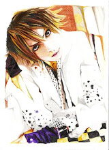
The style is very fine and subtle, with a distinctive cartoon-like feel to them. There is a gentle sense of childhood nostalgia and make-believe among his works, portraying mystical beings in their common natural features that can be imagined through a child’s mind.
DiTerlizzi manages to capture the imaginations of readers with his drawings, whether they are happy or frightful. Another example brings us to one of his drawings of monsters:


His drawing style can be very flexible. The mood of each illustration is changed completely with his choice of technique and colour hue (the dark colours in this piece gives a sense of threat and dirtiness, a very simple factor of provoking fear or disgust). The same drawing style applies; smooth, confident strokes of ink with a wash of colour.


Initially, he uses shading techniques for his non-coloured pieces. This further highlights the flexibility of his style. Among his plain ink drawings, they share similar appearances with each other in terms of line gradation (they have rough multiple strokes for the outline instead of the usual smooth lines for his watercolour drawings). An example of this is from one of his sketches in the book:

These images were scanned from a book. DiTerlizzi’s style of drawing remains distinctive, but the linear forces takes a unique route. He applies cross-hatchings to add depth and the outlines is broken and linked together with a series of small strokes.


More of my writing can be found in my sketchbook.